For years, the design world has been obsessed with "safe" neutrals—shades of oatmeal, greige, and stark gallery white that promised a clean slate but often left our homes feeling somewhat anonymous. But as we look toward the 2026 interior color trends, the pendulum is swinging decisively toward the expressive. We are entering an era of "soulful modernism," where color isn’t just an accent; it’s the primary narrator of our home’s story.
Creating a soulful modern home isn't about painting every wall a neon hue; it’s about intentionality, saturation, and a deep connection to the natural world. From the resurgence of natural pigments to the unexpected pairing of regal purples and sunny yellows, the way we use color is becoming more sophisticated and, ultimately, more human.
Quick Facts: The 2026 Color Forecast
- Standout Pairing: Butter Yellow and Aubergine is the top predicted duo for 2026, favored by 26% of design professionals for its luxe, balanced energy.
- The Growth of "Earth-Driven" Tones: There has been a 40% increase in client demand for forest greens, terracotta, and organic browns as homeowners seek to ground their living spaces.
- The Golden Rule for Small Spaces: Stop using white in dark rooms. Instead, embrace the "Jewel Box" effect with deep, rich tones and light-reflecting finishes.
- The Unifying Element: Use Green as a 'color thread' to link different rooms and draw the outdoor landscape into your interior design.
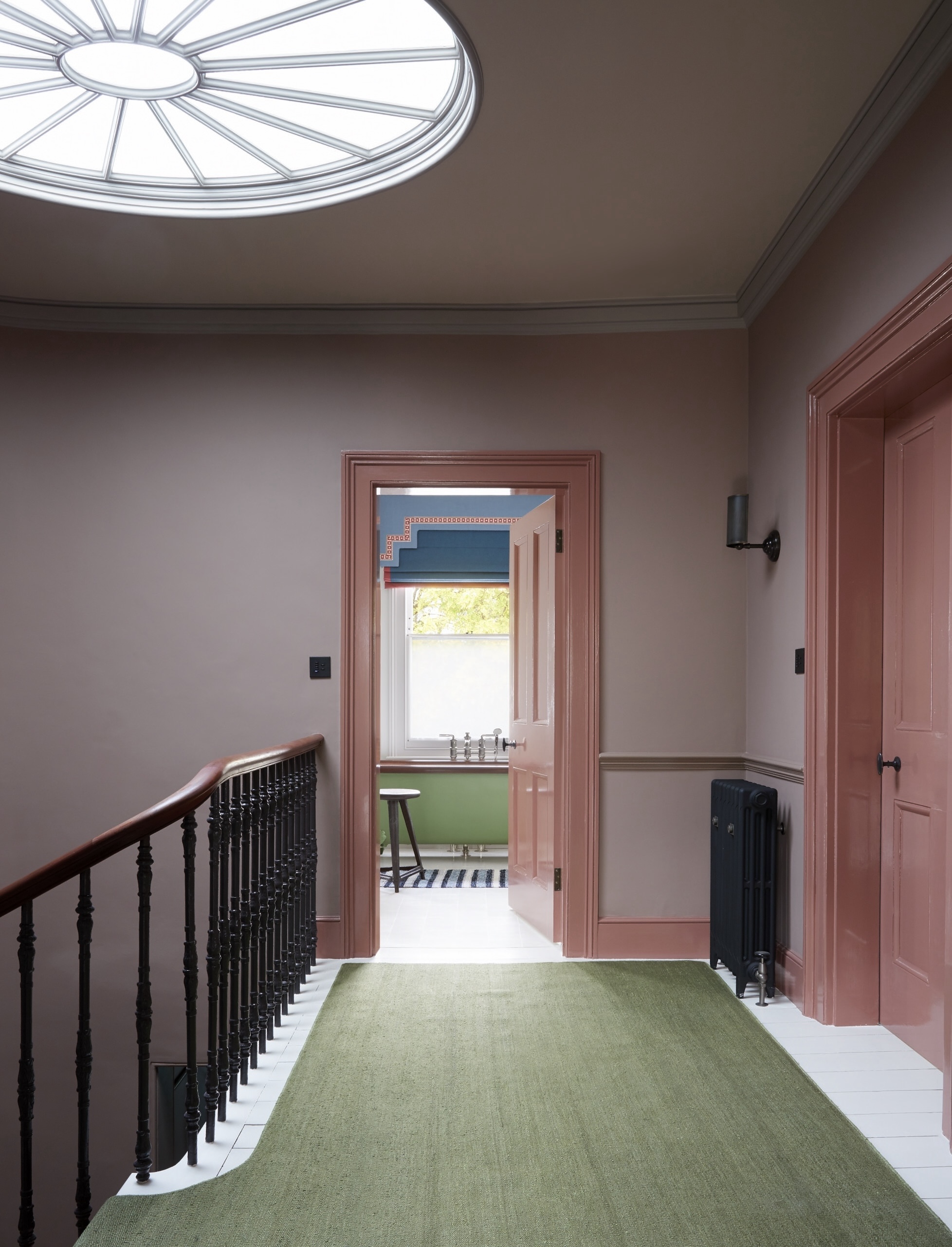
1. Establish a 'Color Thread' with Green
In any high-end interior, there needs to be a sense of continuity—a visual rhythm that prevents the home from feeling like a series of disjointed boxes. Renowned designer Nicola Harding often speaks of a "color thread," and for a soulful modern home, that thread is almost always green.
Because green is the most prevalent color in nature, our eyes perceive it as a neutral. By using green to link different rooms, you soften the lines between the interior and the garden, creating a restorative flow. To create a cohesive feel across different rooms, use green as a 'color thread' to link spaces and draw the outdoor landscape into the interior design.
Expert Tip: Don't feel restricted to a single shade. Define a core palette of five colors for your home, then build out with varying tones. A deep forest green in the entryway can transition into a soft sage in the kitchen, maintaining the "thread" while allowing each room its own personality.
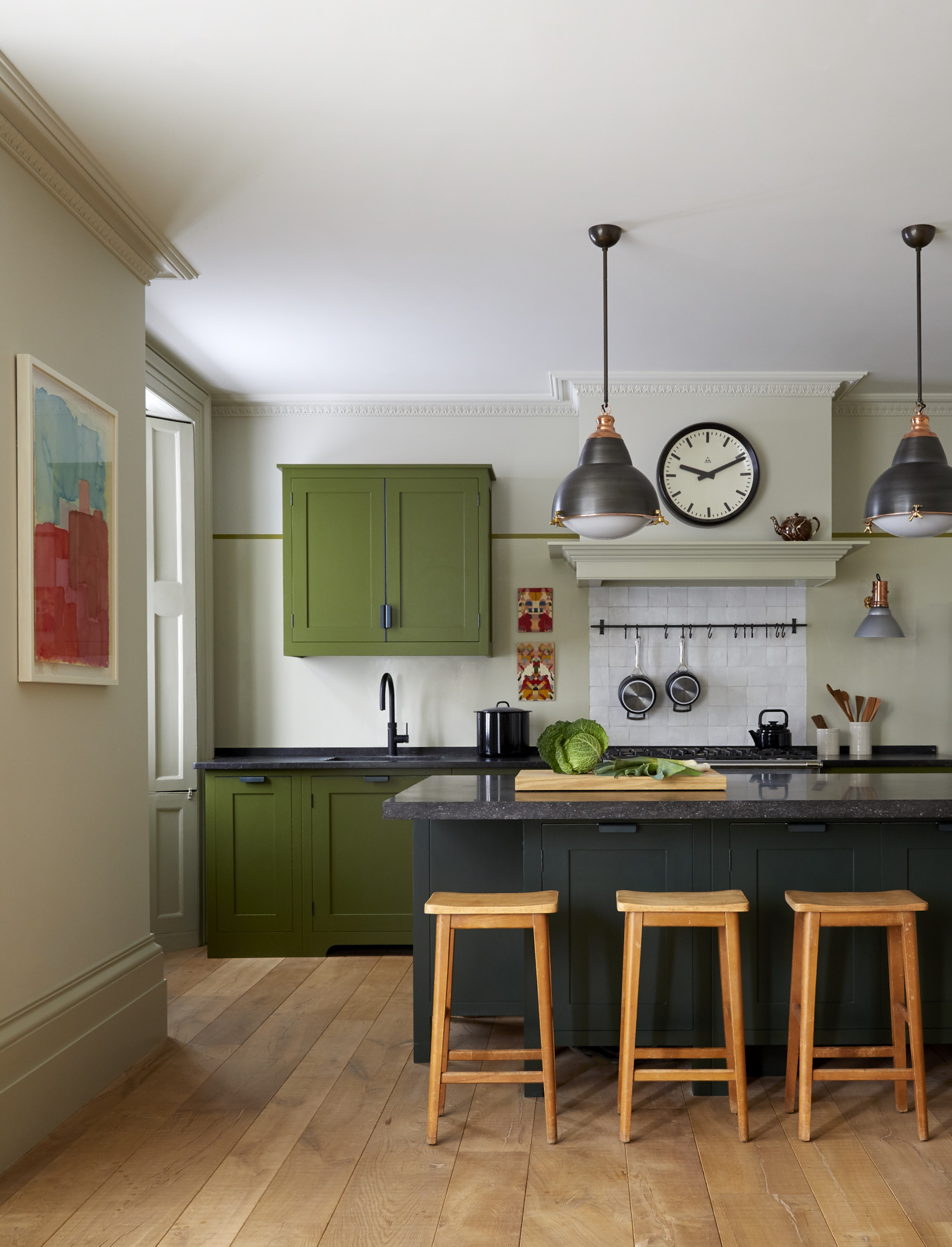
2. Embrace the 2026 'Earth-Driven' Palette
Heading into 2026, we are seeing a significant shift away from synthetic-looking colors toward what I call "earth-driven" palettes. Interior designers report a 40% increase in client demand for 'earth-driven' palettes, specifically forest greens, terracotta, and rich organic browns.
These colors provide an immediate sense of "patina"—a feeling that the home has been there for a long time and has a soul. When using these saturated earth tones, the key is to avoid "flatness." Look for paints that have a subtle movement to them, reflecting the uneven beauty of the natural world. Terracotta isn't just a color; it’s a warmth that mimics the late afternoon sun on clay. When you ground a modern home in these tones, you create an environment that feels stable and nurturing.
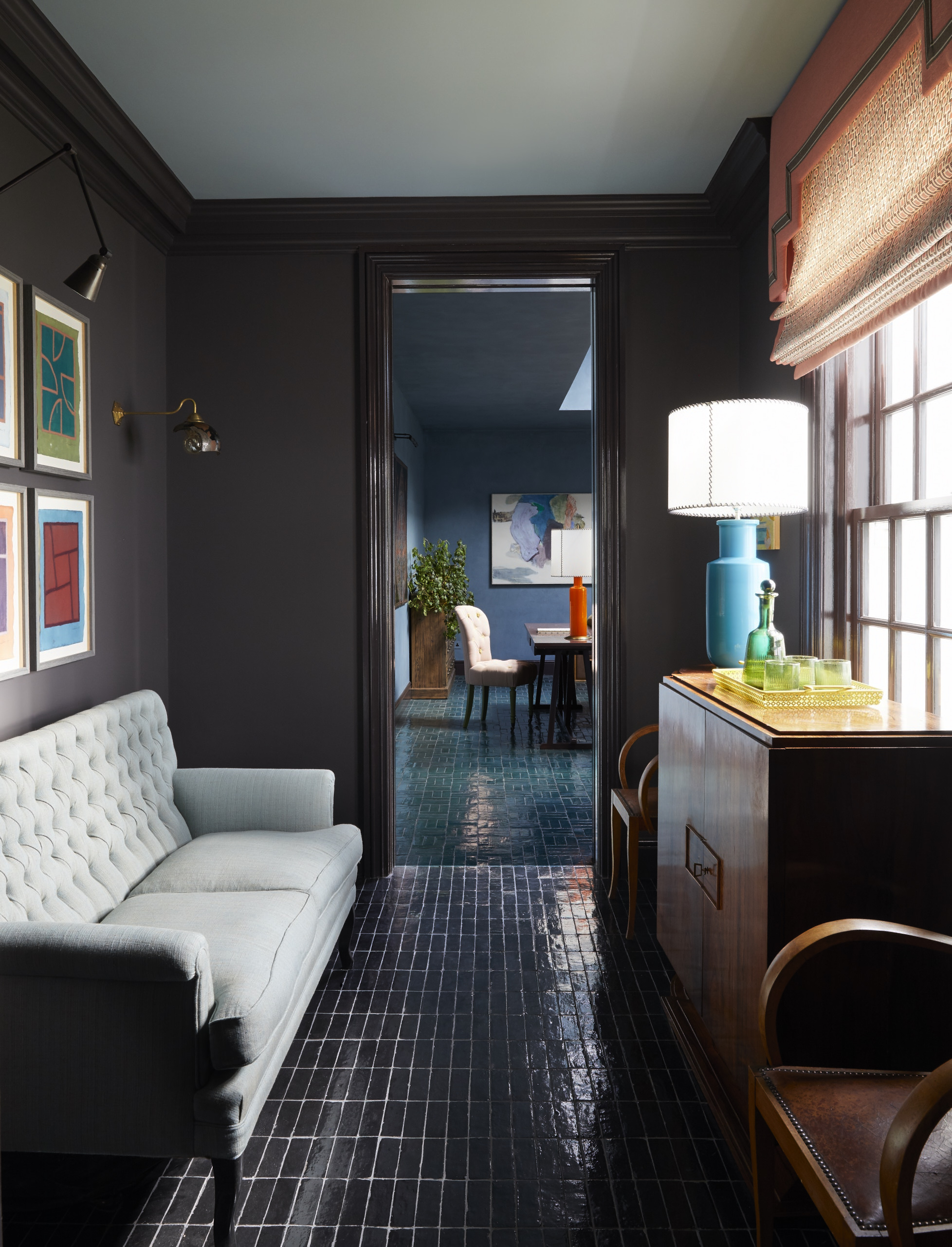
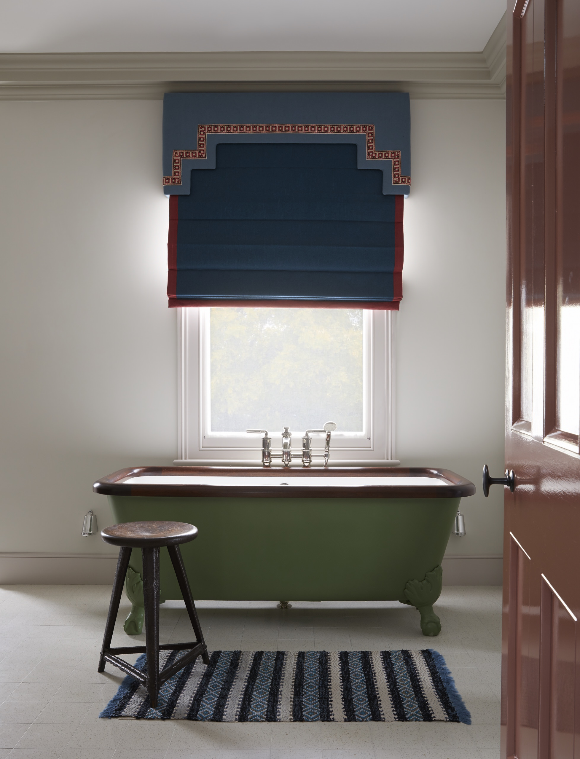
3. Create 'Jewel Boxes' in Small, Dark Spaces
One of the most common mistakes I see in interior styling is the attempt to "brighten up" a small, windowless room with white paint. In a space with no natural light, white simply turns a dull, muddy gray.
For small or poorly lit spaces, avoid safe whites; instead, use deep, rich tones and shiny finishes to create a 'jewel box' effect that adds drama and warmth. Think of a home bar, a powder room, or a small study. By embracing the darkness with a deep chocolate brown, a midnight blue, or a hunter green, you lean into the room's intimacy. Add a high-gloss finish or light-reflecting metallic accents, and the space begins to glow from within, much like a precious gem in a box.
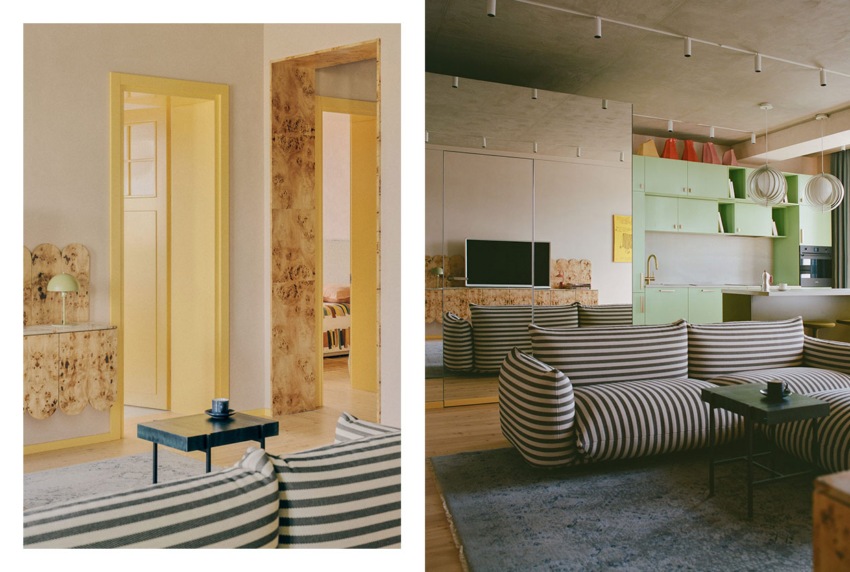
4. Master the Boldest Pairing: Butter Yellow and Aubergine
If you want your home to feel ahead of the curve while maintaining a sense of classic elegance, look no further than the combination of Butter Yellow and Aubergine. The top predicted color pairing for 2026 is Butter Yellow and Aubergine, a combination favored by 26% of design professionals for its unexpectedly luxe and regal feel.
Why does this work? It’s a study in balance. Aubergine (a deep, brownish-purple) provides a heavy, sophisticated anchor. Butter Yellow acts as the "light," lifting the purple and preventing it from feeling too somber. It is a "regal" pairing that feels curated rather than chaotic. To pull this off, use the Aubergine on larger elements like a velvet sofa or a library wall, and use Butter Yellow for the "mischievous" layers—curtains, cushions, or a piece of statement art.
2026 Color Trends vs. Traditional Pairings
| Trend Factor | 2026 "Soulful" Approach | Traditional "Safe" Approach |
|---|---|---|
| Hero Duo | Butter Yellow & Aubergine | Navy & Crisp White |
| Foundation | Earth-driven (Browns, Terracotta) | Cool Neutrals (Grey, Beige) |
| Accent Style | High-Saturation Natural Pigments | Low-Saturation Synthetics |
| Mood | Intimate, Expressive, Rich | Airy, Minimalist, Distant |
5. Flip the Script on Trim and Woodwork
Standard design logic dictates that walls should be colored and trim (baseboards, window frames, doors) should be white. To create a truly modern, soulful space, I encourage you to flip that script.
Try using a darker color on your window frames than on your walls. This creates a "frame" for the view outside, drawing the eye toward the landscape. Alternatively, painting the doors and architraves in a contrasting, bold shade adds a playful sense of "architectural punctuation." Using eco-friendly, chalk-based paints for this purpose allows for a velvety matte finish that feels wonderful to the touch and adds a layer of handcrafted quality to the home.
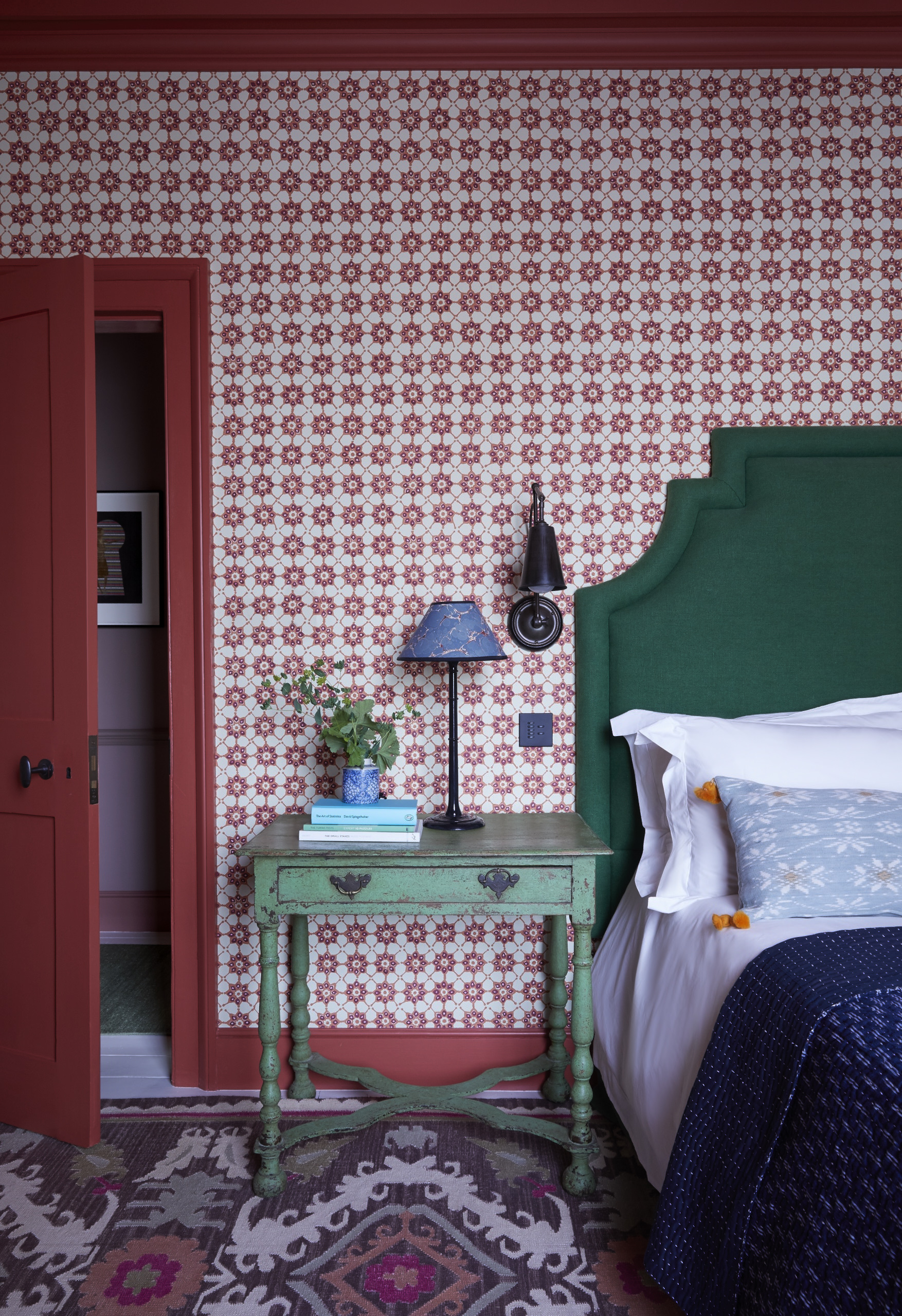
6. Prioritize Natural Pigments for Soulful Depth
There is a biological reason why some rooms feel "flat" and others feel "alive." Most modern paints are acrylic-based—essentially a thin layer of plastic on your walls. Natural pigment paints, such as those from Edward Bulmer, use minerals, earths, and plant dyes.
These natural pigments have a different molecular structure that allows them to absorb and reflect light in a way that feels softer and deeper. Natural color pigments make us feel better compared to plastic-based paints because they resonate with the frequencies of the natural world. When you walk into a room painted with natural pigments, the color feels like it’s in the wall rather than just on it. It creates a tonal depth that changes beautifully from morning to dusk.
7. Balance Saturation with Texture and 'Warm Woods'
Bold color home design can easily become overwhelming if there isn’t a place for the eye to rest. This is where materiality comes in. To balance a highly saturated wall, you need the "quiet" of natural materials.
I always recommend pairing bold colors with "warm woods" like White Oak or Walnut. The organic grain of the wood provides a textural counterpoint to the smooth saturation of the paint. Similarly, natural stone accents—like a travertine coffee table or a marble mantle—offer a neutral, tactile break.
Expert Tip: If you’re using a bold, cool tone like a deep teal or forest green, lean into warmer wood tones to prevent the room from feeling chilly. If you’re using a warm terracotta, a cooler stone like Carrara marble can provide the necessary balance.
8. Start Small with High-Impact Accents
If the idea of an Aubergine-walled living room feels intimidating, remember that a soulful home is built in layers. You can introduce bold color through "mischievous" smaller elements that carry a high visual weight.
A juniper velvet headboard, a patterned Persian rug with flashes of ochre, or even a set of deeply colored ceramic lamps can transform a room’s energy. When testing bold colors, I always recommend the "8-inch rule": Paint a large sample (at least 8 inches square) on a piece of cardstock and move it around the room at different times of the day. Watch how the color reacts to the morning light versus the warm glow of a lamp at night. This ensures that your bold choice feels soulful in every light.
FAQ
Q: Will bold colors make my room look smaller? A: Not necessarily. While dark colors can bring the walls "in," they also create depth. In small, dark rooms, using a bold, dark color actually blurs the edges of the room, making it feel more expansive and intimate rather than cramped.
Q: How do I know if two bold colors will clash? A: Look to nature. If you see the combination in a garden or a landscape, it will likely work in your home. The 2026 trend of Butter Yellow and Aubergine works because it mimics the natural contrast of a wildflower meadow.
Q: Can I use bold colors in a modern, minimalist home? A: Absolutely. Minimalism isn't about the absence of color; it’s about the absence of clutter. A single, bold, saturated wall can act as a focal point, allowing you to keep the rest of the furniture and decor extremely simple while still having a "soulful" home.
Creating a home that feels like "you" requires a bit of bravery. Whether it’s embracing the 2026 preference for earth-driven tones or turning a dark corner into a shimmering jewel box, color is your most powerful tool for transformation. Start with one room, find your "color thread," and watch as your space begins to breathe with new life.