Quick Facts
- The 2026 Aesthetic: A move away from "barely-there" minimalist frames toward substantial, sculptural profiles and bold colorblocking.
- The Monochromatic Secret: Painting the frame, mat, and background in a single hue creates a seamless, museum-quality look that makes the artwork "pop."
- Cost-Efficiency: Upcycling thrifted frames with an all-over paint technique can increase their perceived value and visual impact by up to 40%.
- Key Measurements: Always hang the center of your primary piece at 57 inches from the floor (the "eye-level rule") and maintain 2-3 inches between frames.
- Market Trends: Recent data shows a 65% increase in consumer interest for thick, architectural frame profiles heading into the 2026 design season.
I’ll never spend money on expensive, custom-made picture frames again—not when I can turn a salvaged find into a high-end design statement with one simple DIY. There is a certain thrill in finding a clunky, outdated frame at a thrift store and realizing that beneath its chipped gold leaf or faux-oak finish lies a sculptural masterpiece waiting to be born. In the world of interior styling, we often talk about "the power of paint," but the monochromatic "all-over" technique is the ultimate secret weapon for the modern home. It’s a method that bridges the gap between high-concept gallery curation and the low-stakes joy of a weekend project.
As we look toward the 2026 design landscape, the "less is more" era of thin, invisible wire frames is officially taking a backseat. We are entering a period of "Color Confidence," where our walls are no longer just a backdrop but a narrative. By embracing the monochromatic DIY frame, you aren't just hanging a picture; you are creating an architectural moment.
The 2026 Framing Landscape: Trends to Know
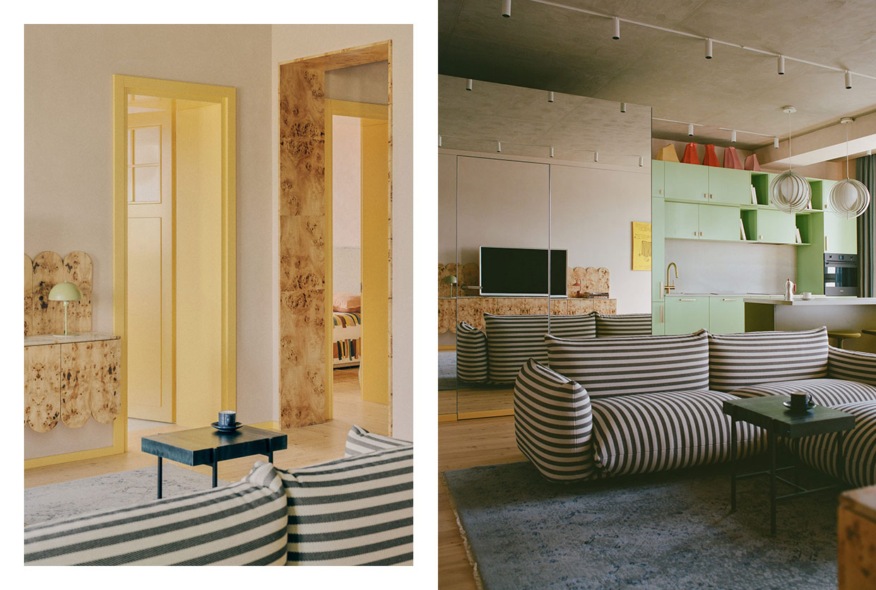
The shift in wall decor is palpable. While the last decade was dominated by the Scandi-minimalist "Gallery Wall" (think thin black frames and wide white mats), the 2026 forecast reveals a hunger for something more substantial. Interior design data indicates a staggering 65% increase in consumer interest for substantial, sculptural frame profiles. People want their decor to feel anchored, purposeful, and permanent.
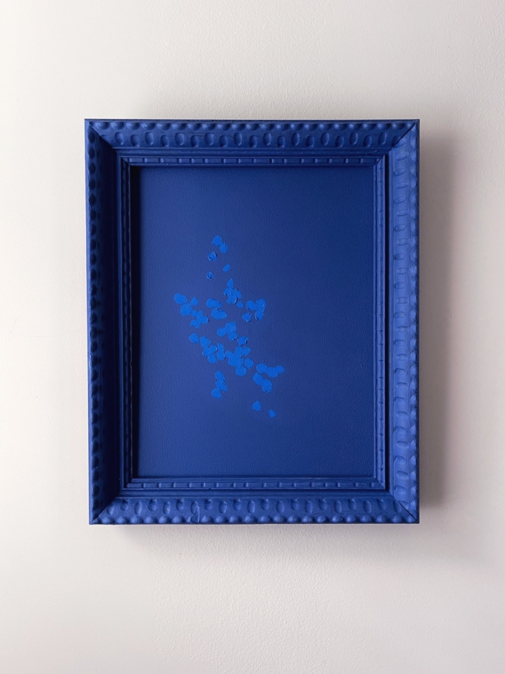
This trend toward the "sculptural" means we are looking for frames with depth, ridges, and ornate carvings—elements that might have felt "too much" in a minimalist home but are perfect for a monochromatic makeover. When you paint a complex, textured frame in a single, matte color, the shadows created by its curves become the art itself.
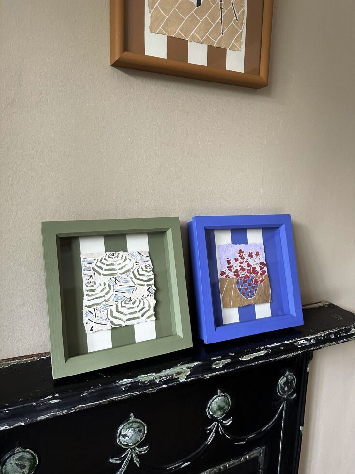
We are also seeing a transition in the metallic department. The "shiny gold" of the 2010s is evolving into muted metallics: brushed champagne, matte bronze, and "antique pewter." These tones don't shout; they hum. However, the most exciting development is the rise of the "Colorblock Gallery." Instead of a mix-and-match approach, designers are curated monochromatic clusters where the frame, the matting, and even the wall behind it exist in the same color family, creating a sophisticated, immersive experience.
The 'All-Over' DIY: How to Create a Monochromatic Frame
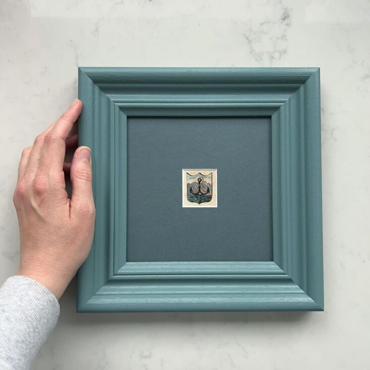
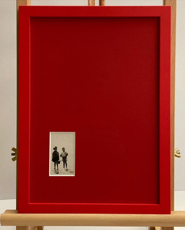
To create a monochromatic picture frame, paint the entire frame, mat, and background panel in a single, cohesive hue to create a 'colorblock' effect that highlights the artwork. This technique eliminates the visual "noise" of traditional framing, allowing the eye to focus entirely on the subject matter while the frame provides a luxurious, architectural border.
Materials You’ll Need:
- A Salvaged Frame: Look for "substantial" profiles (thick wood or plaster frames).
- Sandpaper: 220-grit for smoothing.
- High-Quality Primer: Especially important if the frame is slick or metallic.
- The Paint: Choose a high-quality matte or satin finish. Matte provides that coveted "museum" look, while satin is easier to clean.
- A Foam Roller and Detail Brush: To ensure a smooth, professional finish.
Step-by-Step Process
- Selection and Prep: Choose a frame with some "character"—deep grooves or interesting edges. Remove the glass and the backing. Give the frame a light sand to help the paint adhere, then wipe it down with a damp cloth to remove dust.
- The All-Over Coat: Apply your primer first. Once dry, start with your chosen color. The "sculptural" advantage here is that the paint will pool slightly in the crevices, emphasizing the frame's shape.
- The Matting Transformation: This is the most crucial step for the monochromatic look. Take the paper mat (or the background board) and paint it with the exact same color as the frame. Use a foam roller for a completely flat, non-streaky finish.
- Reassembly: Once everything is bone-dry (wait at least 24 hours to avoid sticking), place your artwork inside. The contrast between the single-color frame/mat and your art will be immediate and striking.
Expert Tip: When choosing the right sheen, I almost always lean toward matte finishes. Matte absorbs light rather than reflecting it, which gives the frame a heavy, stone-like quality that looks significantly more expensive than it actually is.
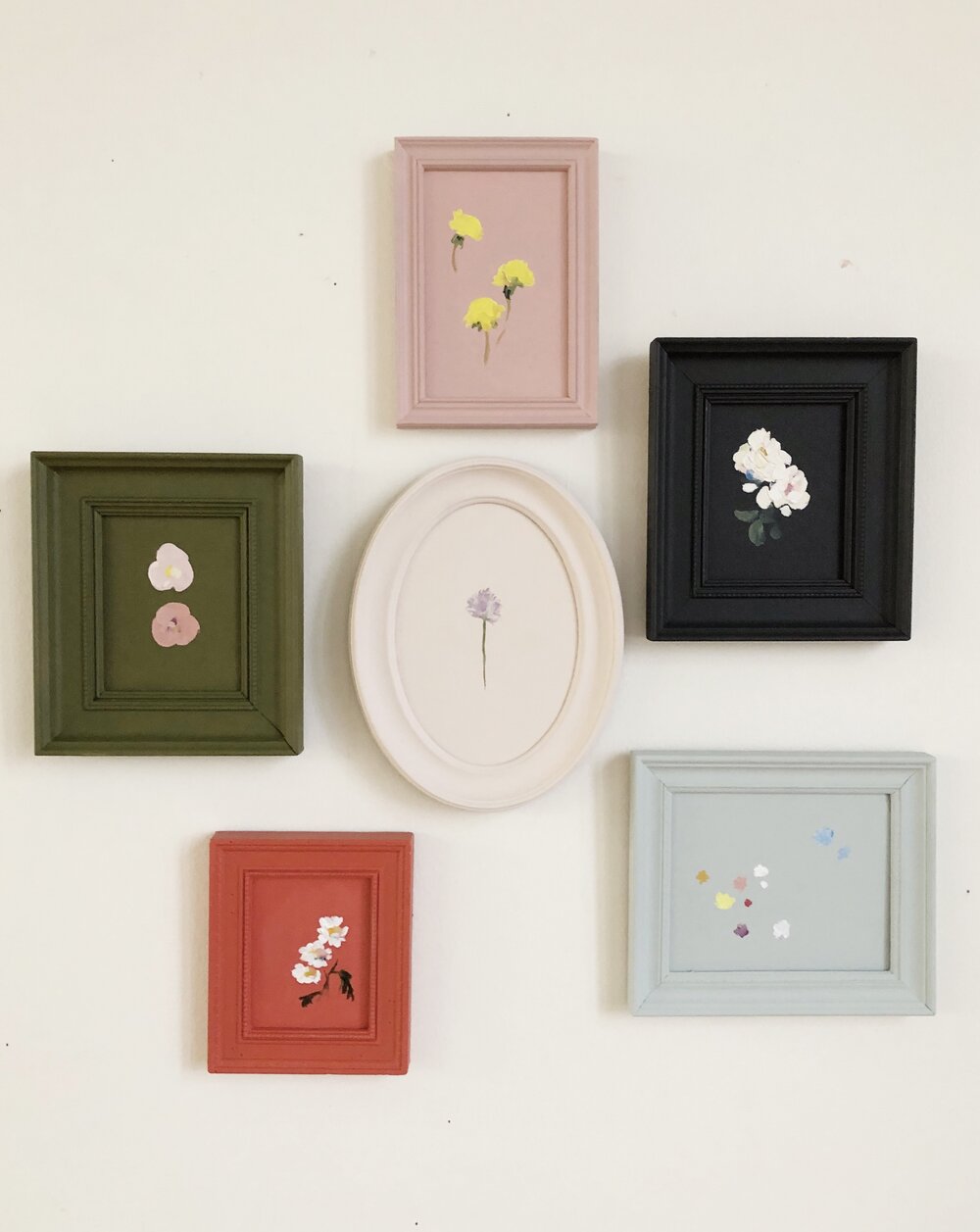
Styling Your Wall: The Monochromatic Gallery Layout
Once you’ve mastered the DIY, the challenge shifts to styling. A gallery wall of monochromatic frames can easily look like a "collection" or a "clutter" depending on your layout. The 2026 framing trends prioritize substantial, sculptural profiles over thin minimalist designs, focusing on muted metallics and curated, eclectic gallery wall layouts.
The Anchor Piece
Every successful wall needs an anchor. Start with one bold, off-center piece to ground the arrangement. This doesn't have to be the largest piece, but it should be the most visually "heavy." A deep navy or terracotta monochromatic frame works beautifully as a focal point.
The 57-Inch Rule
In the design world, we live by the 57-inch rule. This means the center of your primary artwork (or the center of the entire gallery cluster) should be exactly 57 inches from the floor. This is the average human eye level and is the standard used in professional galleries and museums.
Consistent Spacing
For a curated look, aim for a 2-3 inch gap between frames. Anything wider can feel disconnected; anything narrower can feel cramped. If you are using different shapes and sizes of frames, keeping the color monochromatic is what will tie the "eclectic" together into a cohesive "style."
Upcycling Magic: From Thrift Shop to Trend-Setter
Upcycling old frames with an all-over coat of paint is a low-stakes way to add personality to a room while following the 2026 trend of self-expression and authentic style. We are moving away from "fast decor"—the kind of things you buy in a big-box store and see in everyone else's house. Instead, we are looking for objects with a soul.
Analysis of DIY home decor trends shows that monochromatic 'all-over' paint techniques can increase the visual impact of salvaged frames by up to 40% compared to traditional finishes. Why? Because it transforms an "old" object into a "designed" object. A thrift-store frame that looks dated in its original faux-cherry wood suddenly looks like a piece from a high-end boutique when it is rendered in a matte Sage Green or a Deep Charcoal.
There is a beautiful tension in mixing vintage textures with modern color palettes. When you find a frame with Victorian-style flourishes and douse it in a modern, saturated pastel, you are blending two eras. This "curated-over-time" feel is exactly what makes a house feel like a home.
Advanced Tips: Adding Dimension and Light
Once you’ve mastered the basic monochromatic DIY, you can start experimenting with dimension.
- Layering Textures: Don't feel like every frame must be perfectly smooth. Mixing a rough-hewn wood grain with a smooth, matte-painted mat creates subtle visual interest that reveals itself the closer you get.
- The Power of Lighting: To truly highlight the "sculptural" depth of your DIY frames, consider the lighting. Warm-toned picture lights or adjustable wall sconces placed above your gallery wall create shadows within the frame's ridges, emphasizing its architectural profile.
- The Wall-Matching Trick: For the ultimate "designer" move, paint your frames in the exact same color as the wall they are hanging on. This creates a stunning 3D texture effect where the art appears to be emerging directly from the architecture of the room.
FAQ
Q: Can I use spray paint for this DIY project? A: You certainly can, and it’s often faster for the frame itself. However, for the matting and the background panel, I recommend using a brush or a small foam roller with high-quality interior paint. Spray paint can sometimes soak into the paper mat unevenly, whereas a rolled-on paint provides a more professional, "thick" finish that mimics custom-made materials.
Q: Should the artwork also be monochromatic? A: Not necessarily! The beauty of a monochromatic frame is that it creates a neutral (yet bold) border. Vibrant, colorful art looks incredible against a dark, monochromatic frame. Conversely, a black-and-white sketch looks very high-end when placed in a tonal "all-white" or "all-beige" frame.
Q: What if my frame has glass? A: Always remove the glass before painting. The monochromatic look relies on the frame and the mat having the same texture and sheen. If you want to keep the glass to protect your art, simply clean it thoroughly and re-insert it after the frame and mat are completely dry. For a more modern, "gallery" feel, many designers are actually ditching the glass entirely for non-valuable prints to let the textures shine.
Your Next Design Move
The beauty of the monochromatic DIY is that it is fundamentally low-risk. If you don't like the color, you can simply paint over it. It’s an invitation to experiment with the deep jewel tones or the muted metallics you’ve been seeing on Pinterest but were too nervous to try on a whole wall.
By upcycling what you already have—or what others have discarded—you are participating in a more sustainable, authentic form of design. So, the next time you pass a dusty bin of frames at a yard sale, look past the outdated finishes. Look at the profile. Look at the curves. With a single can of paint and a Saturday afternoon, you can turn those "discarded" pieces into the most talked-about feature of your home.