Quick Facts
- Perceived Space: Using receding colors like pale blues and greens can increase perceived room depth by 30%.
- Stress Reduction: 85% of urban residents experience lower stress levels after adopting muted, earth-tone palettes.
- Natural Light: Calm colors with high Light Reflectance Values (LRV) help natural light penetrate up to 15% deeper into a floor plan.
- The 2026 Shift: Trend forecasts indicate a move away from "stark" minimalism toward "warm" serenity, favoring butter yellows and soft olives.
Imagine coming home after a day of navigating the high-decibel energy of the city. You unlock your door, step inside, and... the space feels loud. Even in total silence, a small apartment can feel "noisy." This isn't about the neighbors or the street traffic; it’s about visual volume. When a compact room is filled with high-contrast colors, jagged transitions, and heavy pigments, the walls seem to move inward, creating a subtle, persistent sense of claustrophobia.
As an editor, I often see homeowners try to compensate for small square footage by over-decorating, hoping "personality" will distract from the size. But the secret to a home that feels like a sanctuary isn't found in more things—it’s found in the airiness of your palette. Shifting your focus from decoration to emotional wellness starts with understanding how color interacts with the human psyche and the physics of light.
The Science of Serenity: How Light and Hue Expand Walls
The most common mistake in small-space design is treating walls like boundaries rather than backdrops. Calm colors such as soft whites and pale grays reduce visual weight, allowing natural light to bounce deeper into a room and creating a psychological sense of openness. This isn't just a design "feeling"—it’s rooted in how our eyes perceive distance.
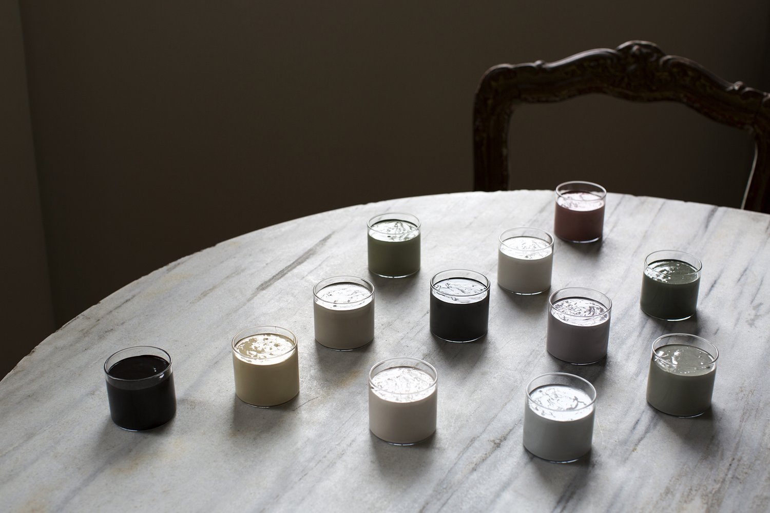
In the world of interior design, we talk about "receding hues." These are typically cool tones—soft blues, misty greens, and lavender-infused grays—that appear further away from the eye than they actually are. A comparative study of 200 studio apartments found that the strategic use of 'receding' blue and green hues increased perceived room depth by approximately 30% compared to high-contrast schemes. When you paint a small bedroom in a pale celadon, the walls don't just sit there; they "retreat," giving your mind the breathing room it craves.
Designer Tip: The LRV Rule When choosing paint, check the Light Reflectance Value (LRV) on the back of the swatch. For small spaces, aim for an LRV of 60 or higher. This ensures the color reflects light rather than absorbing it, making the room feel energized even on gloomy days.
2026 Trend Spotlight: The Muted Earth-Tone Revolution
For years, the default for small spaces was "Gallery White." While effective, it can often feel clinical or cold. As we look toward 2026, the trend is shifting toward what I call the "New Neutrals." These are colors that possess the lightness of white but carry the soul of the earth. We are seeing a massive surge in muted earth tones—colors that feel organic, grounded, and deeply restorative.
Design trend analysis shows that 85% of urban dwellers report a measurable decrease in living-room-related stress after switching to muted earth-tone palettes. These colors work because they mimic the natural world, which our brains are evolutionarily hardwired to find calming.
The 2026 "Quick Look" Palette Table
| Primary Hue | Complementary Accent | Psychological Effect | Best For |
|---|---|---|---|
| Muted Sage | Terracotta | Grounding & Growth | Home Offices |
| Butter Yellow | Soft Aubergine | Cheer & Sophistication | Small Kitchens |
| Sand/Kalaho | Charcoal | Warmth & Stability | Living Areas |
| Pale Sky | Warm Oak | Airiness & Clarity | Bedrooms |

Beyond the traditional beige, we are seeing a rise in "Sand" tones that have a hint of pink or gold. These colors provide a sophisticated warmth that works beautifully in low-light environments.

When we pair these with organic accents like terracotta or olive, we create a space that feels lived-in and layered, rather than just "small and white."
The Unification Strategy: One Color, Infinite Flow
One of the biggest culprits of a cramped feeling is "visual fragmentation." This happens when your eyes are constantly forced to stop at different colors—a white wall, a brown door frame, a gray baseboard. Each transition acts as a speed bump for the eye, making the room feel like a collection of small boxes.
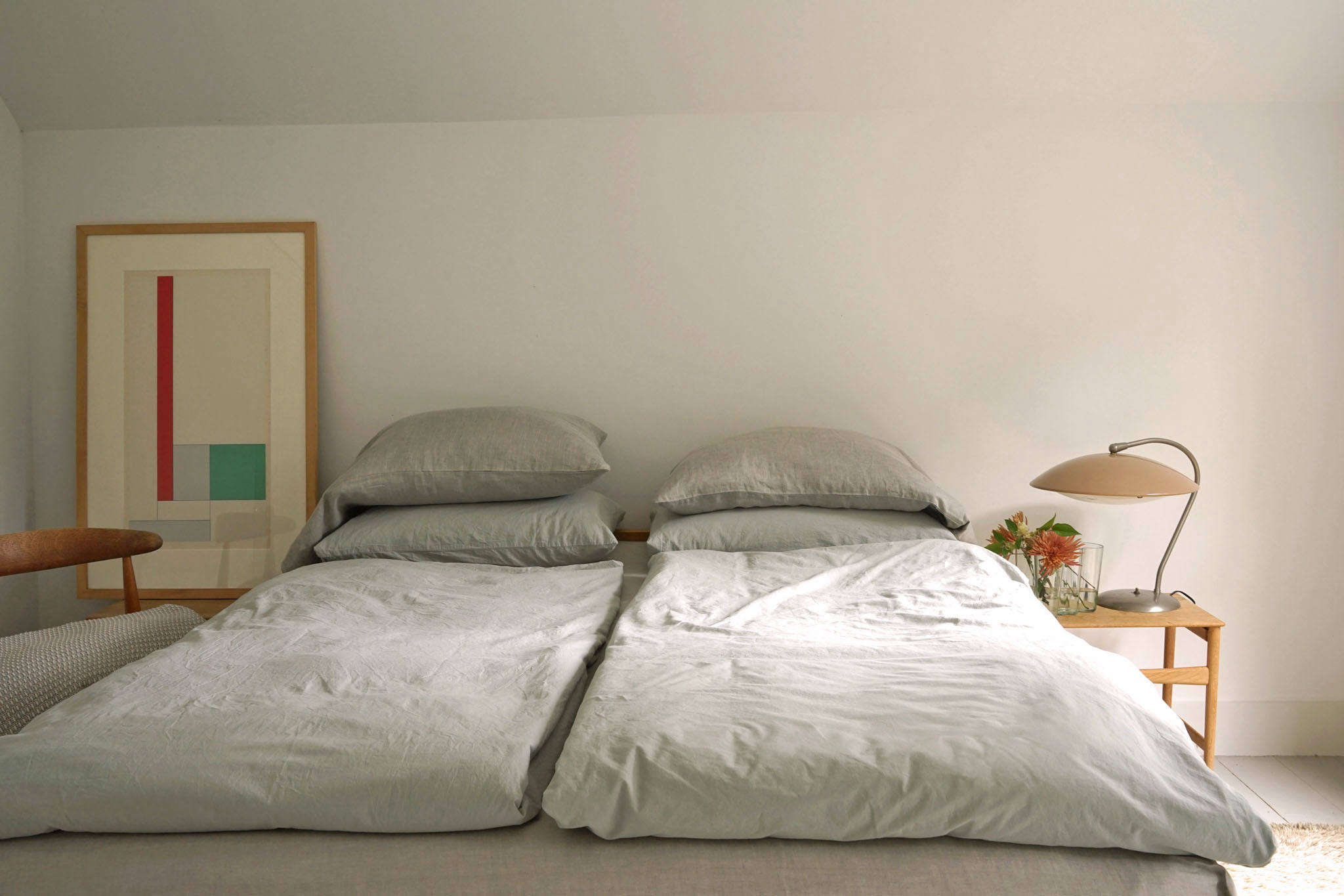
Continuous color schemes unify a floor plan by preventing the eye from stopping at visual fragments, making limited square footage feel like one expansive, cohesive environment. To achieve this, I recommend the "Color Drenching" technique. This involves painting your walls, baseboards, window frames, and even the ceiling in the same shade (or very slight variations of it).
By eliminating the high-contrast seams between the wall and the trim, you create a seamless "envelope." This trick is particularly powerful in studio apartments or homes with awkward architectural angles. When the eye can glide from one corner to the next without interruption, the brain perceives the space as significantly larger than its actual footprint.
Color Zoning for Multi-Functional Living
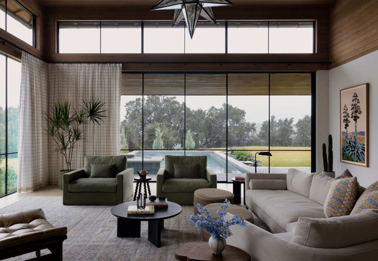
While unification is key for flow, many of us live in "one-room" worlds where the living room is also the office and the dining room. Here, color serves a different, more functional purpose. Warm earth tones like terracotta, olive, and ochre provide a grounding effect that offers emotional clarity and helps distinguish functional zones within a single-room apartment.
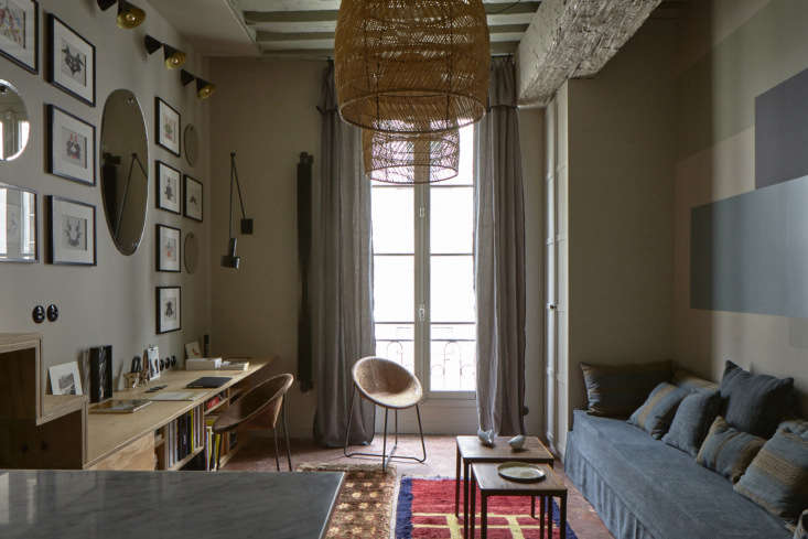
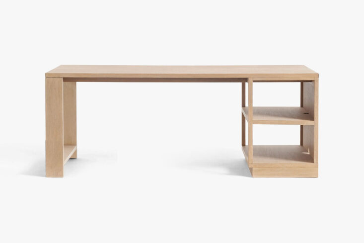
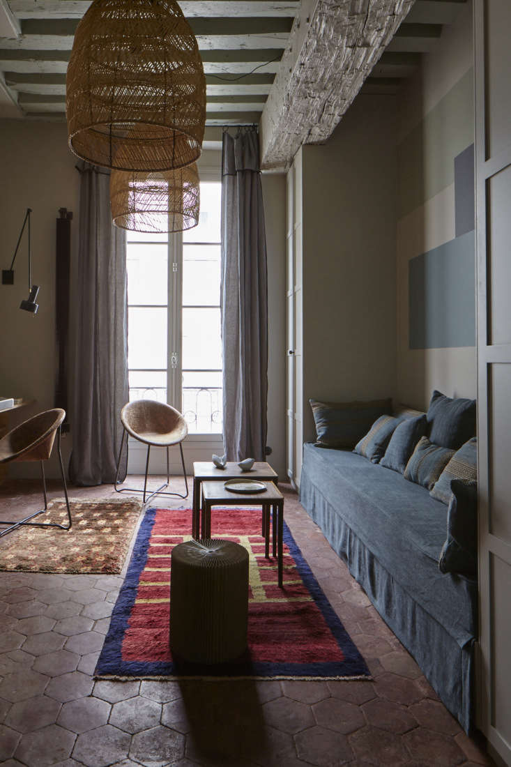
Consider a 270-square-foot Paris apartment I recently reviewed. The designer didn't use physical walls to divide the space. Instead, they used a "zoning" approach with color and material. A soft sand-colored wall defined the sleeping area, while a specific section of the wall near the window featured a custom plywood desk.
By keeping the palette limited to two or three harmonized tones, the apartment felt like it had separate "rooms" without the clutter of partitions. This is the magic of color psychology: it tells your brain when it's time to work and when it's time to rest, all within the same four walls.
Beyond the Walls: Textures and Metals to Enhance Serenity
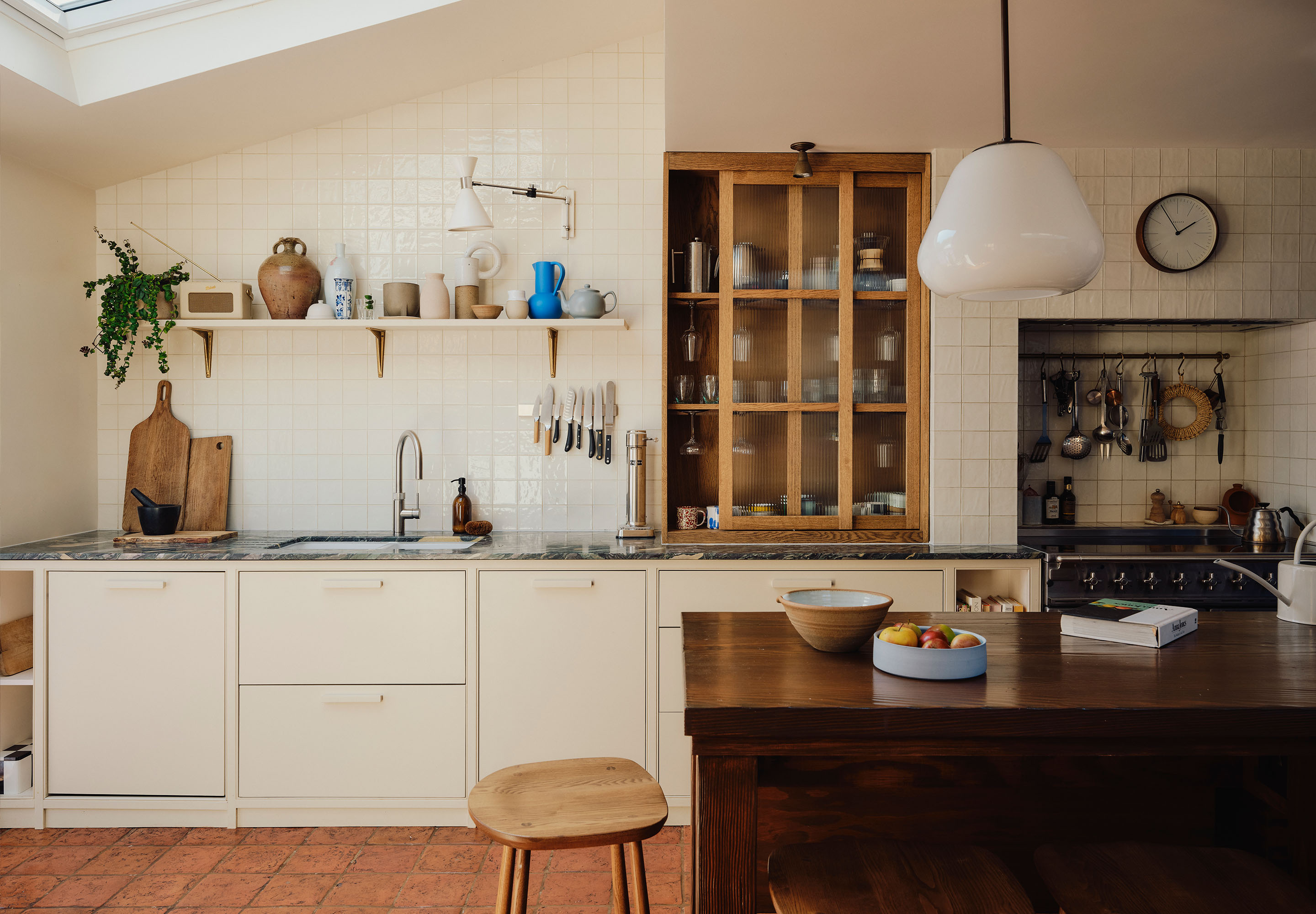
A calm color palette can risk feeling "flat" if you don't introduce texture. In a small space, every surface matters. Once you have your serene wall color, look to the materials that will sit against it.
I always suggest pairing calm paint with natural textures like plywood, linen, and terracotta tiles. These materials have inherent color variations that add depth without adding visual noise. For example, the natural grain of a plywood cabinet provides a subtle pattern that feels much more soothing than a busy wallpaper.
Furthermore, don't underestimate the power of "reflective hues"—not just in paint, but in metals. Small accents of brass or iron can act as jewelry for a room. Brass, in particular, has a warmth that complements the "New Neutrals" beautifully, reflecting light in a soft, glowing way rather than a harsh, mirrored way.
Designer Tip: The 80/20 Texture Rule Keep 80% of your surfaces smooth and color-consistent to maintain the "expansive" feel, and use the remaining 20% for high-touch textures like chunky wool throws, raw wood, or stone.
FAQ: Mastering the Calm Palette
What is the best color for a windowless small bathroom? Avoid pure white; it often turns a dingy gray in windowless rooms. Instead, opt for a "glowing" neutral like a very pale peach or a warm light blue. These colors have enough pigment to hold their own under artificial light, making the small space feel intentional rather than forgotten.
Does 'all-white' ever make a room feel smaller? Yes. In rooms with very little natural light, all-white can feel flat and shadowy, which actually emphasizes the corners and makes the room feel "boxy." In these cases, a slightly deeper "mid-tone" color (like a dusty rose or light mushroom) can actually create more depth and interest.
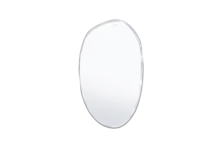
How do I add 'personality' without breaking the calm vibe? Look to organic shapes and "reflective" personality pieces. Irregularly shaped mirrors, for instance, are a designer's best friend. They break up the rigid lines of a small room and bounce light into dark corners, all while adding a unique, sculptural element that feels personal but not cluttered.
Creating Your Sanctuary
Living in a small space doesn't mean living a "small" life. It’s an invitation to be more intentional with the environment you curate. By embracing a calm color palette, you aren't just choosing a paint color; you are choosing a state of mind. You are giving yourself permission to breathe, to think, and to find serenity in the middle of the bustle.
Start with one room. Clear the visual noise. Let the light in. You’ll be surprised at how much bigger your world feels when the walls finally stop shouting.