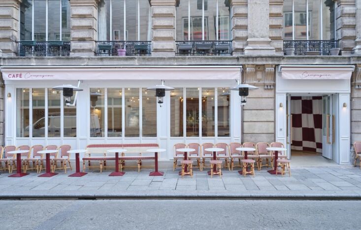
In the heart of Paris’s bustling 2nd arrondissement, near the Palais Royal, lies a sanctuary that defies the typical clatter of a city bistro. When restaurateur Charles Compagnon approached designer Gesa Hansen to create Café Compagnon, his request was simple yet profound: he wanted a "home away from home" that felt protective.
The result is a masterclass in interior balance—a space where brutalist sculptural elements meet the warmth of a family living room. Whether you are designing a high-traffic hospitality venue or looking to bring a sense of "calm-cool" to your own home, Gesa Hansen’s approach offers a blueprint for 2025. By blending tactile materiality with thoughtful spatial engineering, she has created a venue that is as much a workspace as it is a dining destination.
I. Establishing a Calm Foundation
The primary challenge of any urban café is the transition from the chaotic street to the interior sanctuary. Hansen solves this through a philosophy of "protective" design, prioritizing a light, calm aesthetic that anchors the guest the moment they step inside.
1. The Entrance as Theater
The Problem: Entrances often feel like an afterthought, resulting in cold drafts and a jarring transition from the sidewalk to the seat. The Solution: Use textiles to create a "theatrical" threshold. At Café Compagnon, Hansen utilizes heavy checkered entry curtains. These aren’t just for show; they provide immediate acoustic dampening and visual warmth. Inside, the layering of chenille velvet on banquettes ensures that the first physical contact a guest has with the furniture is one of absolute comfort.
2. Framing the View with Wood
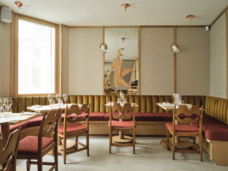
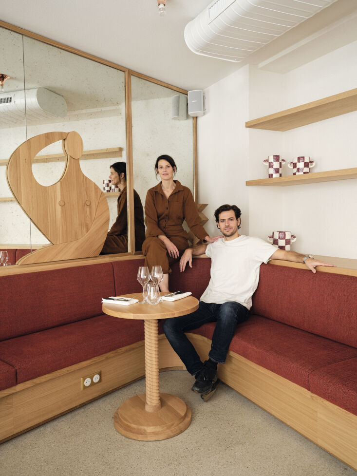
The Problem: High ceilings and open layouts can feel cavernous and uninviting. The Solution: Apply a "Wall to Toe" framing technique. Hansen uses solid oak details to frame sections of the room, creating a sense of "rooms within a room." By incorporating 1950s Henning Kjaernulf oak Razor chairs, she adds historical depth and a sense of permanence. This framing creates a visual boundary that makes large spaces feel intimate and ordered.
II. Materiality and Tactile Balance
Texture is the secret language of interior design. It dictates how we feel about a space before we even realize we’ve looked at it.
3. Treating Wood as a Soft Textile
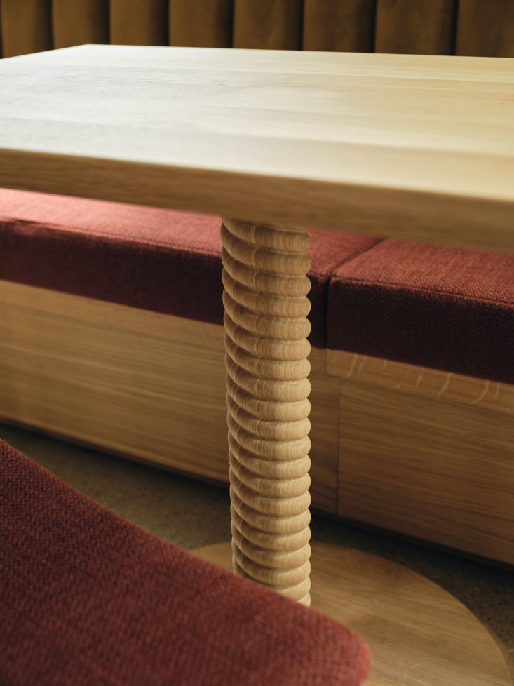
The Problem: Modern interiors often rely on flat, cold surfaces that feel clinical. The Solution: Treat hard materials with the fluidity of fabric. Hansen utilizes "demilune" (half-moon) textures on bar fronts and twisted oak supports for tables. By carving wood into rounded, rhythmic shapes, the material loses its rigidity and invites the hand to touch it. It creates a tactile, warm environment that acts as a soft counterpoint to the more "brutalist" sculptural elements in the room.
4. Zero-Waste Bespoke Furniture
The Problem: Finding sustainable furniture that doesn’t sacrifice high-end aesthetics. The Solution: Look to workshops that prioritize full-cycle production. For this project, 100% of the bespoke oak furniture was manufactured by The Hansen Family, Gesa’s own family workshop in Germany.
By the Numbers
- 100%: Bespoke oak furniture manufactured by The Hansen Family specifically for this project.
- Zero-Waste: The wood production cycle used in the German workshop ensures no material is discarded.
- 3 Zones: The dining layout is divided into three specific zones to cater to different guest needs throughout the day.
- 40%: The percentage of patrons who utilize the space for both work and dining, thanks to the integrated power solutions.
5. Durable Textures for High Traffic
The Problem: Hallways and transition zones often suffer from scuffs and wear, making the design look dated quickly. The Solution: Repurpose exterior materials for interior durability. Hansen used "typical facade bricks" in the hallways. Not only are they incredibly affordable and durable, but their natural earthy tones provide a grounding color palette that hides high-traffic wear while adding a layer of industrial chic.
III. The Art of Light and Reflection
Lighting can make or break a guest’s confidence. In hospitality design, the goal is to make everyone look—and therefore feel—their best.
6. The Flattery of Foxed Mirrors
The Problem: Standard clear mirrors can feel cold and provide a "harsh" reflection under artificial light. The Solution: Use foxed or weathered mirrors. Hansen installed large panels of mirrors with an aged patina throughout the café. The foxing breaks up the reflection, providing a softer, more golden glow that is significantly more flattering for guests. It enhances the room’s mood, making it feel like a space with history rather than a brand-new build.
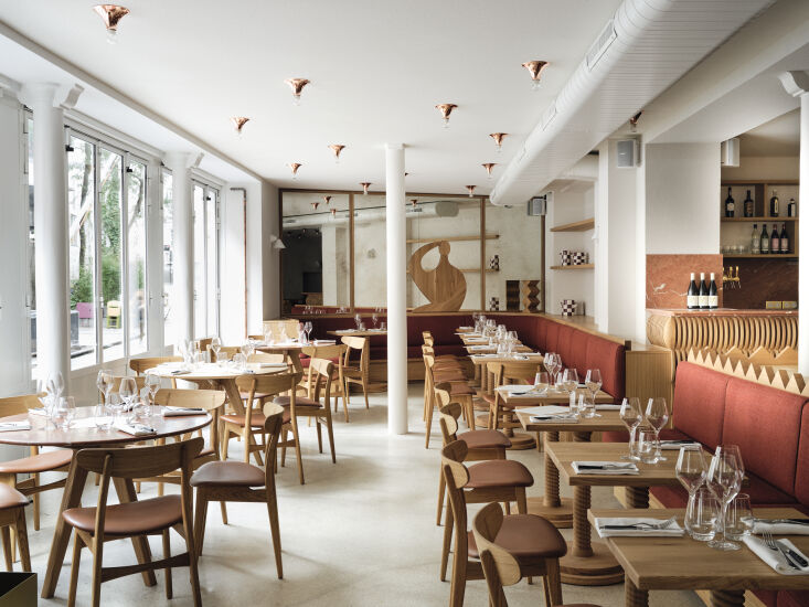
7. Constellation Lighting
The Problem: Traditional grid lighting can feel rigid and corporate. The Solution: Mimic the "chaos" of nature. Hansen utilized copper lights arranged on dual dimmers to create a "starry sky" effect. The irregular placement creates pockets of light and shadow, allowing the atmosphere to shift from a bright, productive morning café to a moody, intimate evening wine bar.
IV. Spatial Engineering for Modern Needs
The way we use public spaces has changed. We no longer just eat; we work, we socialize, and we dwell.
8. The 3-Zone Dining Layout
The Problem: Modern patrons often stay for hours, mixing work with leisure, which can clutter a dining room. The Solution: Engineer for a "living room" usage pattern. Hansen designed a 3-zone layout specifically for the 40% of patrons who utilize the space for both work and dining. This includes ubiquitous power sockets discreetly tucked near seating areas, allowing remote workers to feel welcome rather than like they are "camping" in a restaurant.
9. Sculptural Branding
The Problem: Corporate branding often feels out of place in a cozy, residential-style interior. The Solution: Translate history into art. Hansen turned 3D metal sculptures—inspired by the work of Carlos Ferreira de la Torre (the owner’s grandfather)—into 2D wooden wall art. This honors the family heritage of the restaurateur while adding a unique visual identity to the walls that feels like a gallery rather than a marketing exercise.
V. Color and Emotional Resonance
Color is the most direct way to influence the emotional "temperature" of a room.
10. The 60-30-10 Palette Rule in Practice
The Problem: Using too many bold colors can feel overwhelming, while too few can feel bland. The Solution: Follow the classic ratio with a twist. Hansen balances the space with a foundation of warm oak (60%), accents of "Rojo Alicante" marble and claret-red tiles (30%), and pops of mustard-yellow seating (10%). This creates a cohesive "rosy" atmosphere that feels energized yet grounded.
11. Statement Stone vs. Painted Walls
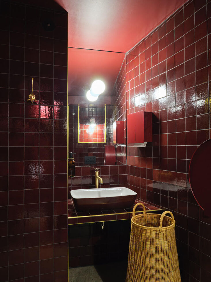
The Problem: Paint can feel "flat" and requires frequent touch-ups. The Solution: Use colored stone as a primary source of pigment. In the restrooms and secondary spaces, Hansen uses dramatic claret-red tiles and statement stone. This ensures that even the smallest spaces feel luxurious and high-concept, using the material's natural color for longevity and depth.
12. Handmade Personal Touches
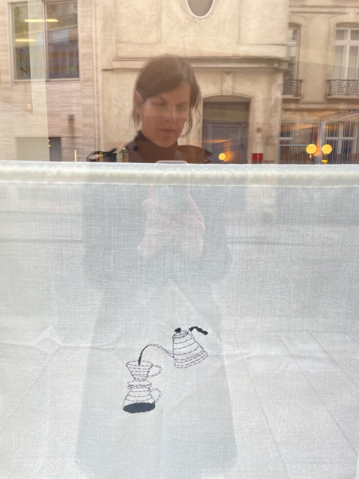
The Problem: Perfectly polished interiors can sometimes feel "soulless." The Solution: Incorporate artisanal, handmade elements. To finish the "protective" interior of Café Compagnon, Hansen included hand-embroidered linen curtains by artist Audrey Demarre. These small, delicate details provide a human touch that contrasts with the stone and wood, effectively "soulling" the space.
Conclusion: Designing for 2025 and Beyond
Mastering interior balance isn't about choosing between form and function; it’s about making them inseparable. Gesa Hansen’s Café Compagnon succeeds because it treats the visitor as a whole person—someone who needs to work, eat, and feel beautiful all at once. By treating wood like fabric, mirrors like mood-setters, and layouts as living rooms, we can create spaces that don't just look good on camera, but feel good to live in.
FAQ
How can I apply the 'foxed mirror' look at home without a full renovation? You can find vintage foxed mirrors at antique fairs or use DIY "mirror aging" kits (involving diluted muriatic acid) on standard inexpensive mirrors to achieve that warm, weathered patina.
What is the best wood to use for the 'Wall to Toe' framing technique? Oak is the gold standard for this technique due to its durability and timeless grain. For a more budget-friendly option, ash or stained pine can work, provided the joinery is clean and consistent.
Does a 3-zone layout work for small apartments? Absolutely. You can define zones using different floor textures (a rug for the 'living zone') and lighting levels (a bright lamp for the 'work zone' versus dimmers for the 'dining zone').